• IELTS
IELTS Academic Writing Task 1 Topic Different sources of air pollutants - Line Graph
 12518 Reads
 3 min Read
The blog first presents a specific sample question on IELTS Academic Writing Task 1 based on Line Graphs. It is then followed by three model answers to the same specific question on Line Graphs which can be easily compared by the students to score a higher band score in the IELTS exam.
There will be a picture or diagram in IELTS Writing Task 1 of the academic version on which you must compose a report. The line graphs could be one of several graphic representations. An example of a line graph for IELTS Writing Task 1 that discusses the causes of air pollution in the UK over time is provided below. Let's use the ideas we have to determine how to structure the report.
IELTS Writing Task 1 – Sample Question
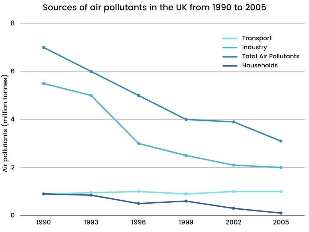
Topic: The graph below shows different sources of air pollutants in the UK from 1990 to 2005. Summarise the information by selecting and reporting the main features and make comparisons where relevant.
Also read: IELTS Exam pattern
IELTS Writing Task 1 – Line Graph Sample Answer 1
The line graph presents information on three causes of air pollution in the UK from 1990 to 2005.
It is evident that the total number of air pollutants has reduced over time. Industrial-related air pollution has largely decreased significantly.
Nearly 7 million tonnes of air pollutants were present in the UK overall in 1990. In 1999, this amount fell precipitously to 4 million tonnes. Following that, it continued to decline, reaching a little over 3 million tonnes at the end of the aforementioned period.
The industry emitted 5.5 million tonnes of air pollutants in 1990. This amount then decreased over the course of time, reaching 2 million tonnes by 2005, with a particularly rapid reduction occurring between 1993 and 1996. In contrast, the amount of air pollution from home and transportation sources was smaller.
From 1990 to 2005, the amount of air pollution caused by transportation remained essentially unchanged at 1 million tonnes. On the other hand, residential pollution dropped from about 1 million tonnes in 2005 to just under 0.1 million tonnes.
Also read : IELTS Syllabus
IELTS Writing Task 1 – Line Graph Sample Answer 2
Significant air pollution sources in the UK between 1990 and 2005 are depicted in the graph.
The level of air pollution has mostly decreased throughout time, with the transportation sector being the lone exception, where it has increased.
With over 6 million tonnes, the industrial sector led all other sources of air pollution in the UK in 1990. The total was roughly 8 million tonnes when added to other sectors. Every family and the transportation industry produced 1 million tonnes annually.
The overall amount of pollutants released into the air during the following fifteen years steadily fell to 5 million tonnes, a decrease of roughly 2 million tonnes. Additionally, this was accomplished since the industrial sector likewise has shown a yearly decrease in emission rate.
This was just 2 million tonnes in 2005, a decline of around 4 million tonnes overall. When the household sector and the transportation sector are taken into account, there is a difference in the rate of air pollution.
From 1990 to 1999, the UK's household emittance rate stayed constant at 1 million tonnes. However, it dramatically decreased after 1999, reaching absolute zero in 2005. On the other hand, the amount of pollution by the transport industry has grown rapidly since 1999, reaching 3 million tonnes in 2005.
Also read : what is IELTS?
IELTS Writing Task 1 – Line Graph Sample Answer 3
The given graph shows the four UK industries and the amount of air pollutants they each released between 1990 and 2005. The four distinct colored lines indicate the overall amount of industrial, transport, and residential sectors. The measurements are presented in million tonnes.
If the whole picture is taken into account, we may observe a decrease in the weight of air pollutants between 1990 and 2005.
The graph above shows that in 1990, the industrial sector had the greatest impact on air pollution. It survives by releasing up to 6 million tonnes of atmospheric pollution. In the UK, homes and the transportation sector were both at the same threshold of only 1 million tonnes at the same time. It stayed at 1 million tonnes together with the home sector until 1999, with a minor blip in the transportation sector.
The overall amount of air pollutants released decreased significantly during the following fifteen years, and it continued to drop until it reached 5 million tonnes annually in 2005. Consequently, there was a 2 million tonnes difference in the amount of air pollutants released.
With a decrease of 2 million tonnes from 1990, when there were roughly 6 million tonnes, to 2005, the industry underwent a substantial transition in terms of the sector.
Additionally, after remaining consistent for a sizable portion of the fifteen years under consideration, families in the UK attained the zero-emission goal in 2005. In 1999, the decline got underway.
On the other hand, the number of air pollutants discharged into the atmosphere by the transportation sector increased rapidly in 1999. It was 4 million tonnes in 2005.
Also read: Eligibility Criteria for IELTS
FAQ
Get great articles direct to your inbox
The latest news, articles, and resources, sent straight to your inbox every month.
Popular Universities to Study Abroad
World class education waiting for you.

Centennial College - Performing Arts Centre
Ontario, Canada • 2 Programmes
Tuition Fee : CAD 13500-14000 / year
.webp)
Conestoga College - Milton - Steeles Avenue Campus
Ontario, Canada • 1 Programmes
Tuition Fee : CAD 14000-14500 / year
Fresenius University of Applied Sciences - Hamburg Campus
Hamburg, Germany • 2 Programmes
Tuition Fee : EUR 12240-12240 / year

Kingston University London - Kingston School of Art, Knights Park
England, UK • 39 Programmes
Tuition Fee : GBP 13000-16500 / year
Charles Sturt University - Orange Campus
New South Wales, Australia • 2 Programmes
Tuition Fee : AUD 35000-67100 / year

Flinders University - City Campus
South Australia, Australia • 27 Programmes
Tuition Fee : AUD 0-0 / year

Shorelight Group - University of Nevada Reno
Nevada, USA • 114 Programmes
Tuition Fee : USD 28000-28500 / year

Middlesex University (MDX) - Dubai Campus
Dubai, UAE • 61 Programmes
Tuition Fee : AED 62500-63000 / year
Latest at CANAM
Events, webinar, college / university visits and more.

10 Jul
Study and Work in Australia/NZ - Urban and Regional Opportunities for Students
Study in Australia, New Zealand • Webinar
11:00AM

10 Jul
UK and Germany Application Day 2026
Study in UK, Germany • Application Days
All Canam Offices • 11:00AM

Popular English Language Proficiency Exams
IELTS Online
- Live Classes


Blogs and Articles
Curated content to keep you updated on the latest education trends, news and more.
PTE Accepted Universities in Australia
Updated on • Oct 01,2025 02:40 PM IST • PTE
Updated on • Jul 17,2025 05:33 PM IST • USA
Part-Time Jobs for International Students in Australia
Updated on • Jul 17,2025 03:44 PM IST • Australia
Updated on • Jul 12,2025 04:02 PM IST • USA
Updated on • Jul 11,2025 11:32 AM IST • Education
CPT vs OPT: Meaning, Difference, and How to Apply
Updated on • Jul 11,2025 10:40 AM IST • USA
Masters in Computer Science in UK: Top Colleges, Eligibility, Scholarships
Updated on • Jul 10,2025 11:29 AM IST • study in the UK
Highest Paying Jobs in the World
Updated on • Jul 08,2025 01:40 PM IST • Study Abroad
MBA in Australia for Indian Students: Best Universities, Requirements, Scholarship, Courses, Jobs
Updated on • Jul 08,2025 01:35 PM IST • Australia
Canada vs Australia: Which Country is Better for Indian Students in 2025?
Updated on • Jul 07,2025 12:46 PM IST • Education
France vs Germany: Which Is Better for International Students?
Updated on • Jun 30,2025 05:15 PM IST • Education
Top 10 Agricultural Universities in USA
Updated on • Jun 27,2025 05:25 PM IST • USA
Most In-Demand Future Careers in 2025
Updated on • Jun 26,2025 04:41 PM IST • Education
How Much Do Nurses Make in the U.S.?
Updated on • Jun 23,2025 03:59 PM IST • USA
Updated on • Jun 21,2025 02:00 PM IST • USA
MBA in UK: Universities, Eligibility, Types, and Career Opportunities
Updated on • Jun 19,2025 04:09 PM IST • UK • study in the UK
Scholarships in France for Indian Students
Updated on • May 29,2025 05:22 PM IST • France
Intakes in Dubai for Indian Students
Updated on • May 27,2025 03:34 PM IST • Study in Dubai
France Student Visa 2025 – Requirements, Fees, Checklist & Application Process
Updated on • May 23,2025 03:36 PM IST • France
MBA in France for Indian Students in 2025
Updated on • May 22,2025 05:35 PM IST • France
Related Blogs and Articles
A little effort to provide an authentic and reliable content for keen readers!!
Updated on • 11-04-2025 • IELTS
Describe Your Hometown IELTS Speaking Part 1 Topic
Updated on • 07-04-2025 • IELTS
PTE vs IELTS : Know the Difference and Which is Easier?
Updated on • 21-03-2025 • IELTS
IELTS Exam Dates 2025 in India
Updated on • 18-01-2025 • IELTS
IELTS Reading Practice Tests 2025: Reading Passage and Sample Questions
Updated on • 15-01-2025 • IELTS
IELTS Letter Writing Topics 2025
Updated on • 15-01-2025 • IELTS
Canada IELTS band requirements 2025
Updated on • 10-01-2025 • IELTS
Updated on • 25-11-2024 • IELTS
Updated on • 21-11-2024 • IELTS
Updated on • 02-11-2024 • IELTS
Linking Words for IELTS Speaking - Word List & Tips
Updated on • 25-10-2024 • IELTS
IELTS Writing Task 2 - Academic and General Topics with Sample Answer
Updated on • 25-10-2024 • IELTS
IELTS Writing Task 2: Tips, Lessons & Models
Updated on • 25-10-2024 • IELTS
IELTS Test Report Form (TRF): Number, Tracking, Validity and Sample
Updated on • 25-10-2024 • IELTS
IELTS Speaking Samples and Answers
Updated on • 25-10-2024 • IELTS
Updated on • 25-10-2024 • IELTS
Updated on • 25-10-2024 • IELTS
IELTS Sample Charts for Writing Task 1 Practice
Updated on • 25-10-2024 • IELTS
IELTS GT Writing Task 1/ IELTS Letter Writing
Updated on • 25-10-2024 • IELTS
Updated on • 25-10-2024 • IELTS